15 Paper Butterfly DIY Wall Ideas That Add a Soft Touch
I didn’t expect something as simple as paper butterflies to change the feel of a room, but the first time I tried it, the effect was surprisingly gentle and calming. I had a blank wall that felt a little too plain, and instead of going for framed art, I cut a few butterfly shapes just to experiment. When I placed them on the wall, the space instantly felt lighter, almost like it had a soft movement to it. It wasn’t bold or dramatic—it was quiet, delicate, and exactly what the room needed.
As I played around with different layouts and colors, I realized how flexible this idea can be. You can keep it minimal with a few subtle accents or go all in with layered designs that create depth and texture. The beauty of paper butterflies is how they catch light and create soft shadows, giving the wall a slightly dimensional look without adding anything heavy. It’s one of those DIY projects that feels creative without being complicated.
Now, I see paper butterfly decor as an easy way to add a soft, personal touch to any space. It works in bedrooms, living areas, or even small corners that need a bit of life. You don’t need expensive materials or advanced skills—just a little time and imagination. Let’s get into some ideas that can help you create a wall that feels light, airy, and full of charm.
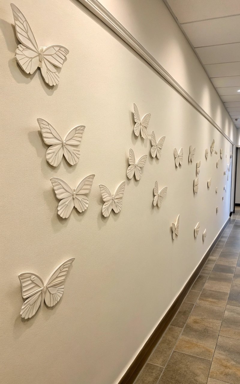
1. Floating Butterfly Wall Scatter
I placed butterflies randomly across the wall, and it created a natural, floating effect that feels effortless. The spacing gives each piece room to stand out. It looks like they’re gently moving across the space. The design feels soft and organic. It’s simple, but very effective. Pro Tip: Vary sizes for a more natural look.
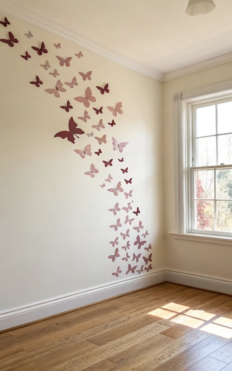
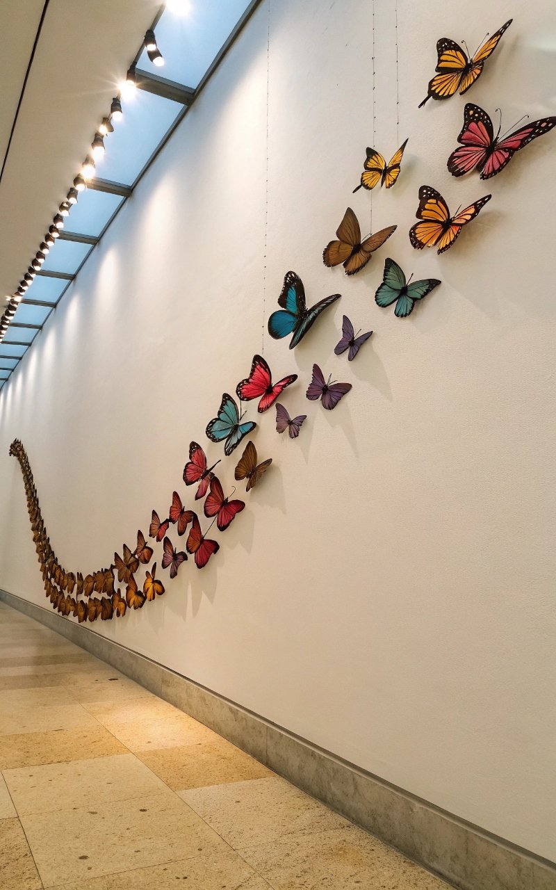
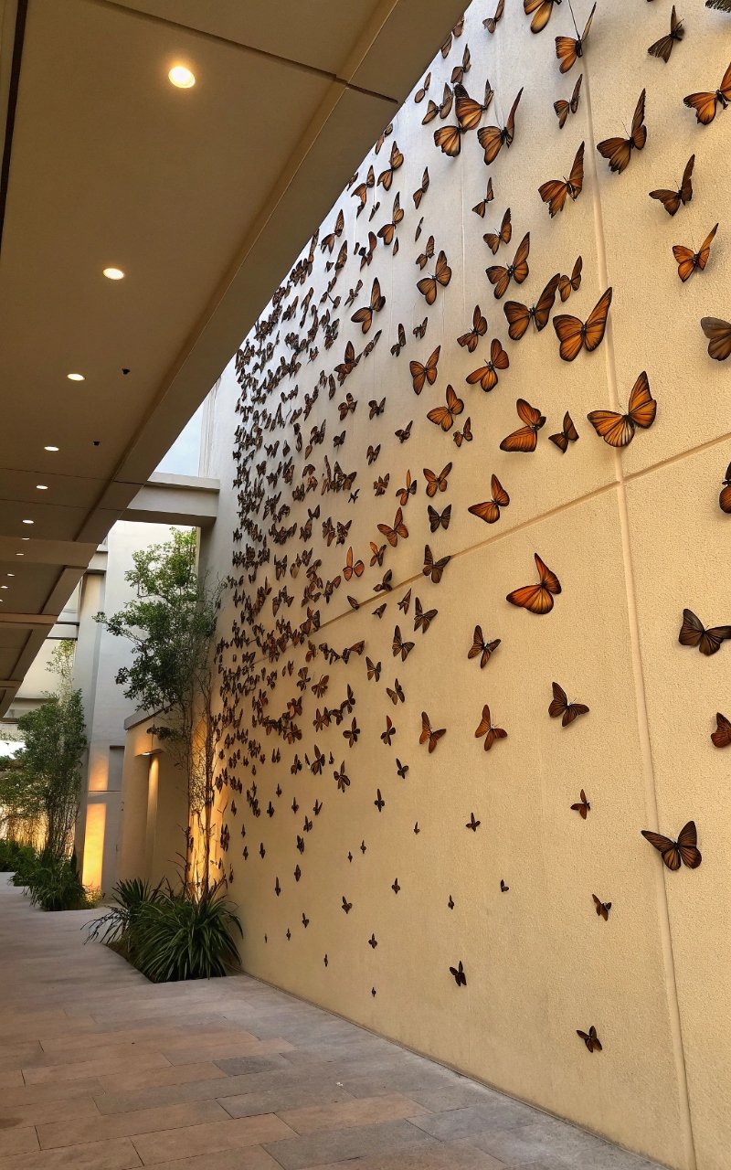
2. Ombre Butterfly Gradient
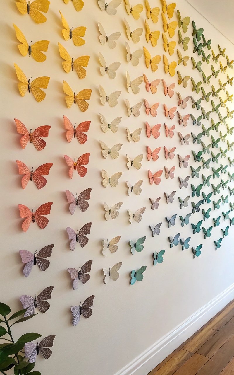
I arranged butterflies in a color gradient, and it added a smooth transition that feels visually calming. The shift in tones creates depth without clutter. It draws your eye naturally across the wall. The effect feels intentional and polished. It’s subtle, but beautiful. Pro Tip: Stick to one color family for cohesion.
3. Heart-Shaped Butterfly Layout
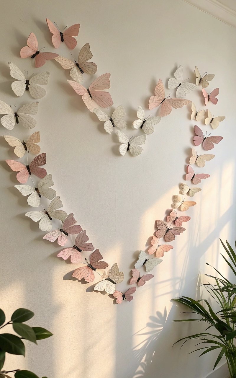
I formed a heart shape using butterflies, and it became a soft focal point that feels personal and warm. The shape stands out while still looking delicate. It’s perfect for bedrooms or cozy spaces. The design feels thoughtful. It’s simple, but meaningful. Pro Tip: Outline the shape lightly before placing.
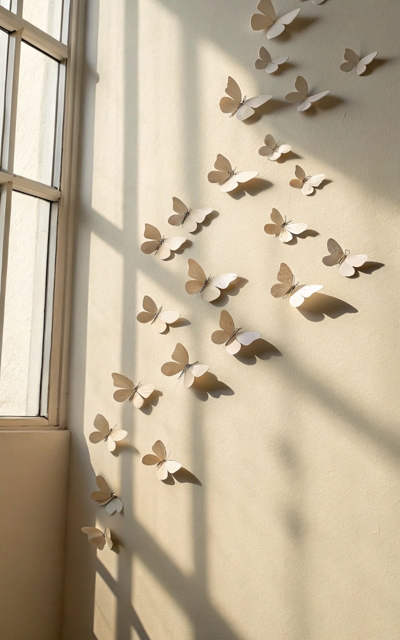
4. Corner Butterfly Accent
I placed butterflies in one corner of the wall, and it created a light, flowing detail that doesn’t overwhelm the space. The design feels subtle and balanced. It adds interest without taking over. The corner placement feels unique. It’s minimal, but impactful. Pro Tip: Let the design fade outward for a softer look.
5. 3D Folded Butterfly Effect
I folded the wings slightly, and it added dimension that makes the butterflies look more lifelike. The shadows create depth and movement. It changes depending on the light. The effect feels soft and dynamic. It’s simple, but adds so much. Pro Tip: Use thicker paper for better structure.
6. Butterfly Wall Frame Design
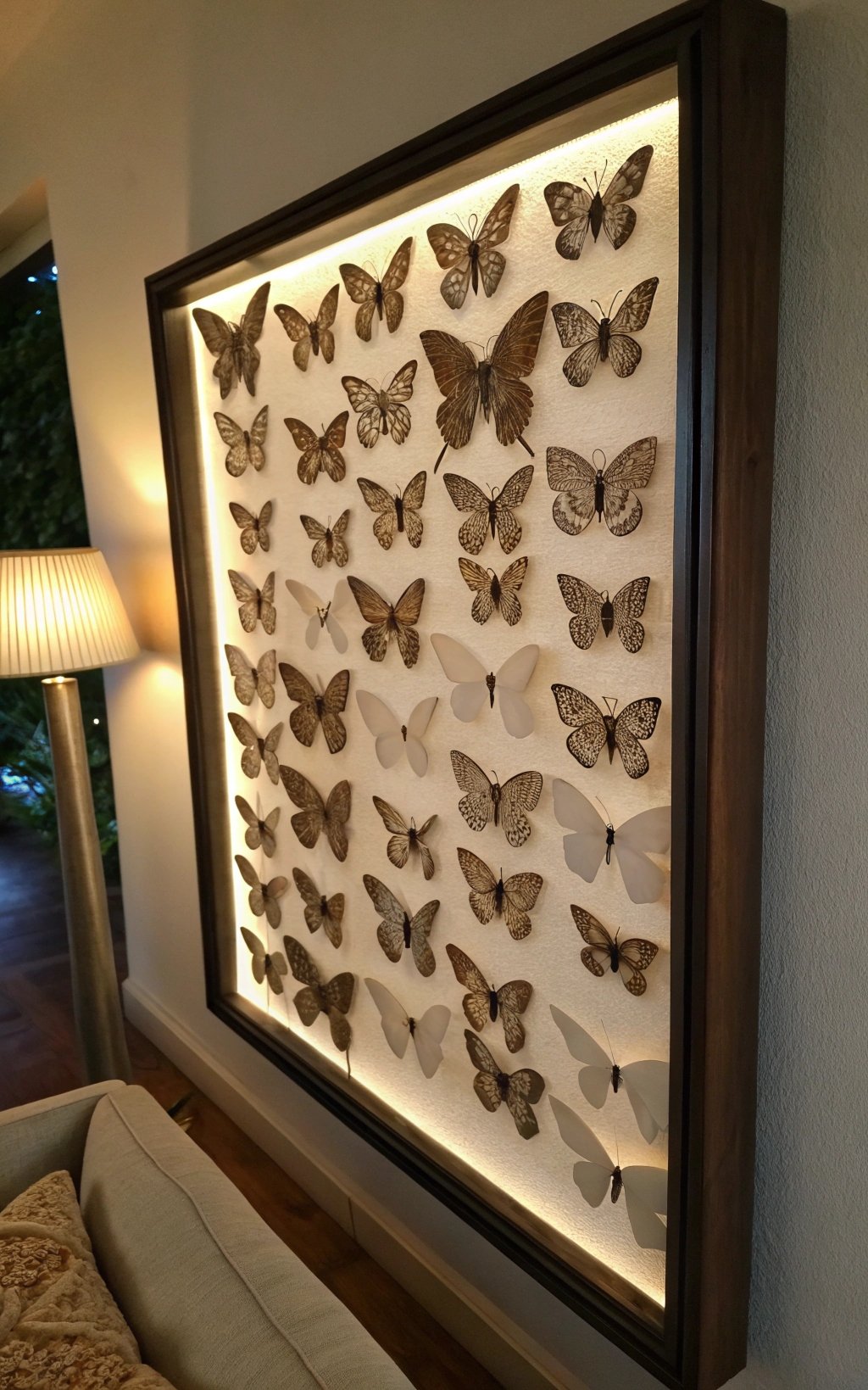
I arranged butterflies inside a frame, and it turned the display into a piece of art. The border keeps everything contained and neat. It feels more structured while still being creative. The design stands out without clutter. It’s a nice balance. Pro Tip: Use a shadow box frame for depth.
7. Minimalist Butterfly Line
I created a simple line of butterflies across the wall, and it added a clean, modern touch. The spacing keeps the design light and uncluttered. It works well in minimalist spaces. The look feels intentional. It’s subtle, but effective. Pro Tip: Keep alignment consistent for a polished look.
8. Ceiling-to-Wall Butterfly Flow
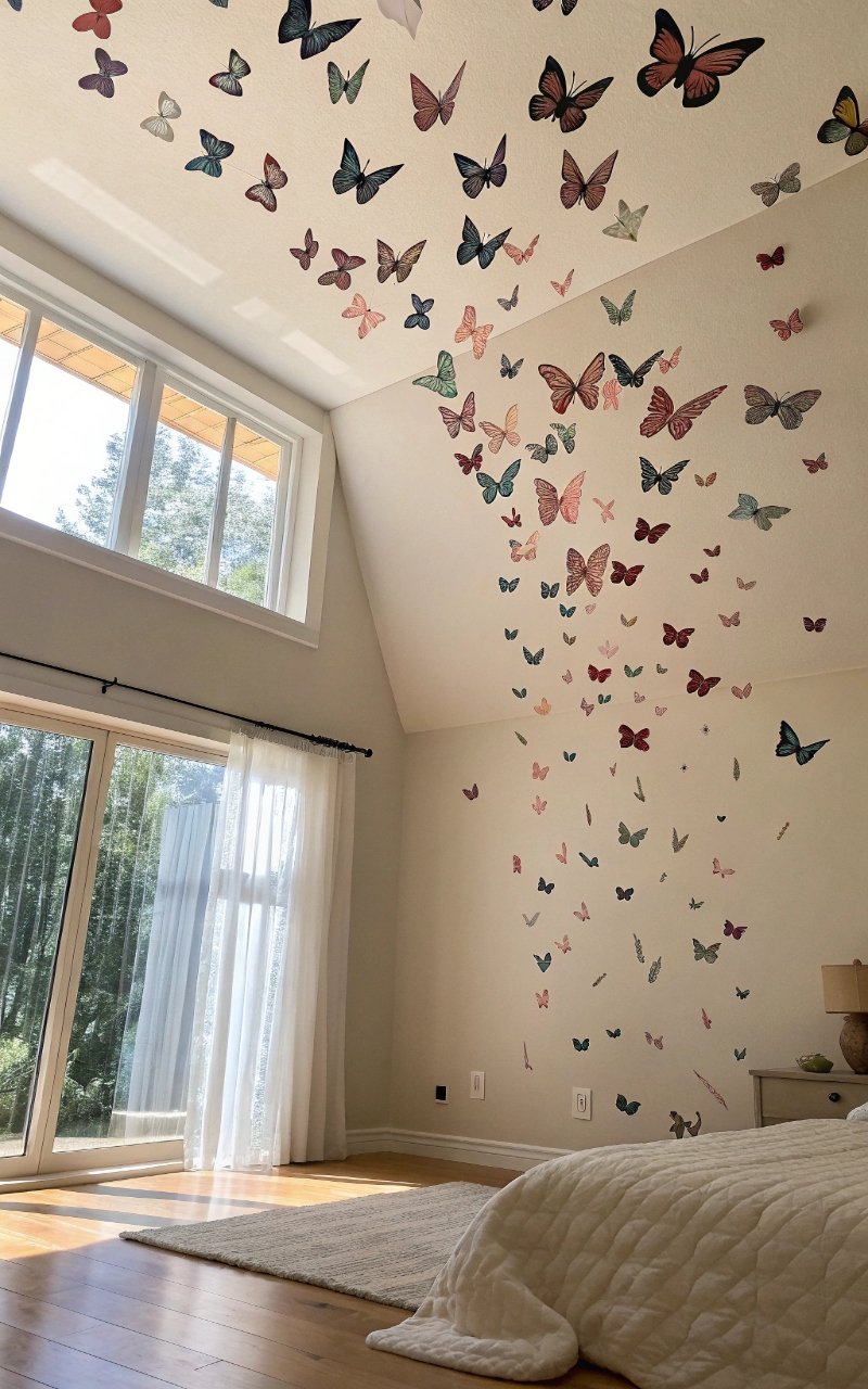
I extended the butterflies from the wall onto the ceiling, and it created a flowing effect that feels immersive. The movement adds a unique perspective. It draws your eye upward. The design feels airy and open. It’s creative and unexpected. Pro Tip: Keep density lighter as it spreads.
9. Butterfly Wreath Arrangement
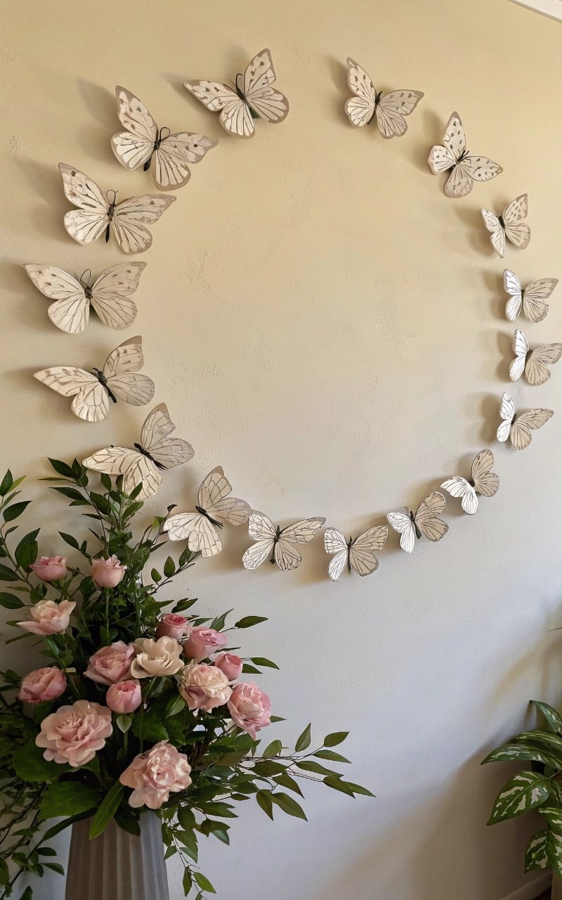
I formed a circular wreath with butterflies, and it added a soft, decorative focal point. The shape feels balanced and complete. It works well above furniture or beds. The design feels cozy and inviting. It’s simple, but charming. Pro Tip: Use similar sizes for a cleaner circle.
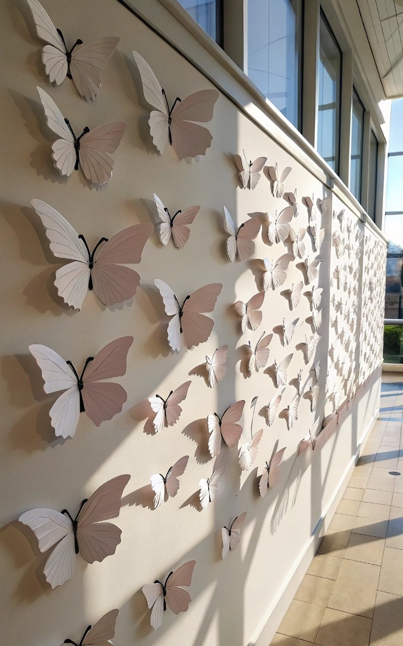
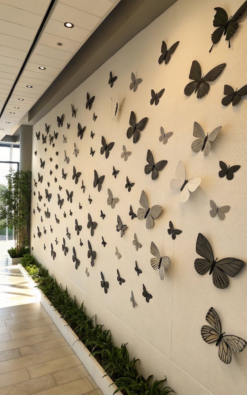
10. Mixed Pattern Butterfly Display
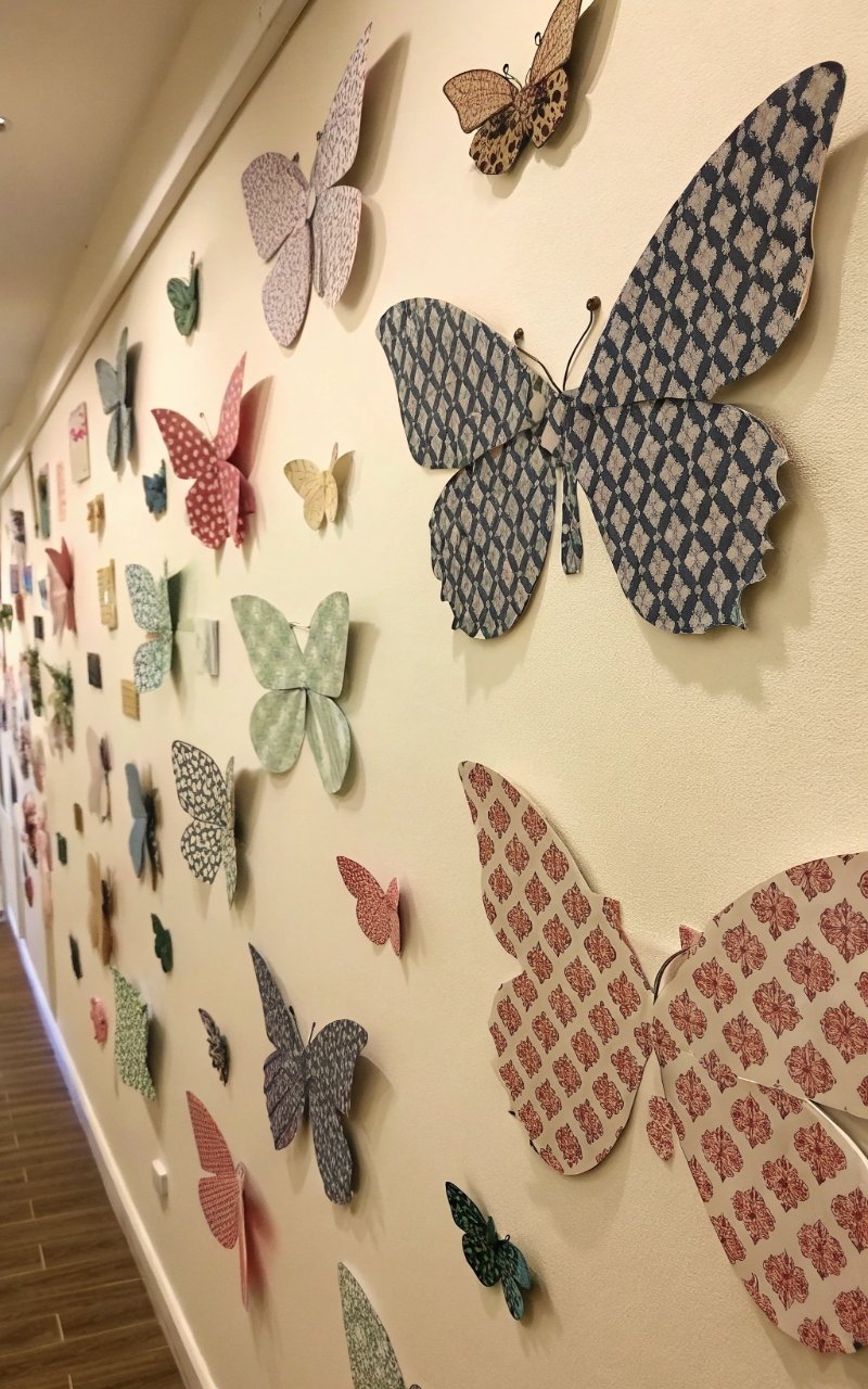
I used different paper patterns, and it added texture and personality without overwhelming the wall. The mix keeps things interesting. It feels playful but still balanced. The design has more depth. It’s creative and fun. Pro Tip: Stick to a cohesive color palette.
11. Butterfly Trail from Furniture
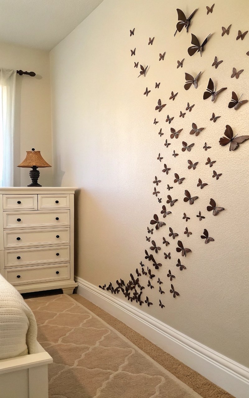
I started the design near a piece of furniture and let it trail upward, creating a connected look. It ties the wall and furniture together. The flow feels natural. It adds movement to the space. It’s subtle, but effective. Pro Tip: Keep the base area slightly denser.
12. Monochrome Butterfly Design
Using one color for all butterflies created a clean, cohesive look that feels calm and elegant. The simplicity keeps it from feeling busy. The texture adds interest. It’s minimal but still decorative. It’s a great option for modern spaces. Pro Tip: Use different sizes for variation.
13. Butterfly and Fairy Light Combo
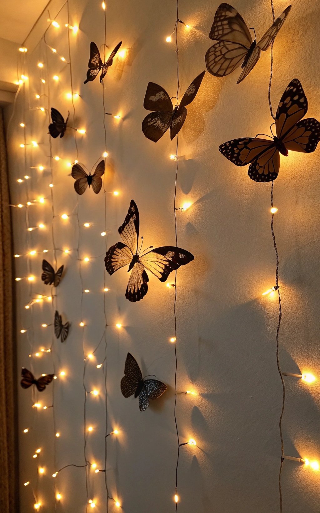
I combined butterflies with soft string lights, and it created a glowing wall that feels warm and magical. The light enhances the shapes beautifully. It adds both visual and ambient detail. The effect feels cozy. It’s simple, but really stands out. Pro Tip: Use warm white lights for a softer glow.
14. Diagonal Butterfly Flow
I arranged butterflies in a diagonal line, and it added a dynamic element that feels more energetic than straight lines. The movement guides your eye across the wall. It feels modern and creative. The design stands out subtly. It’s simple, but unique. Pro Tip: Keep spacing consistent for balance.
15. Clustered Butterfly Accent
I grouped butterflies in one area, and it created a focal point that feels intentional and soft. The density adds depth while the edges fade out naturally. It draws attention without overwhelming. The look feels layered. It’s simple, but impactful. Pro Tip: Gradually reduce size toward the edges.
Conclusion
Paper butterfly wall decor offers a gentle way to transform a space, adding movement, softness, and personality without overwhelming the room. These ideas show how something so simple can create a meaningful visual impact when placed thoughtfully. It’s about layering light details that bring the wall to life in a subtle, calming way. That’s what makes this style so appealing.
What makes these designs so versatile is how easily they adapt to different spaces and styles, whether you prefer something minimal or more expressive. You can start small and build over time, adjusting the layout until it feels right. Even a few butterflies can shift the atmosphere of a room in a noticeable way.
As you try these ideas, focus on how the arrangement feels rather than just how it looks. Let your creativity guide the process and don’t worry about making it perfect. In the end, it’s those soft, personal touches that make your space feel warm, inviting, and uniquely yours.