14 Black and White Kitchen Ideas with a Minimalist Touch
I used to think black and white kitchens felt a little too sharp, almost like they belonged in magazines more than real homes. But after living with a space that felt visually busy all the time, I started craving something quieter—something that didn’t demand attention the moment I walked in. One weekend, I simplified the palette, removed a few unnecessary elements, and leaned into clean contrast. The result wasn’t cold like I expected—it felt calm, balanced, and surprisingly inviting. That experience completely changed how I see minimalist design.
As I explored more black and white combinations, I realized the key isn’t just the colors themselves—it’s how they’re used. Soft textures, subtle finishes, and thoughtful placement keep the contrast from feeling harsh. When done right, the space feels intentional rather than empty, and modern without losing warmth. It’s all about balance, letting each element breathe instead of competing for attention. And honestly, once everything clicks, the simplicity becomes the most satisfying part.
Now, I see black and white kitchens as a way to create clarity in a space that’s often busy and functional. The design feels timeless, easy to maintain, and adaptable to different styles. Whether you want something sleek or slightly softer, these ideas can help you build a kitchen that feels clean, modern, and comfortable to use every day. Let’s get into some minimalist black and white kitchen ideas that actually work.
1. Matte Black Cabinets with White Walls

I paired matte black cabinets with crisp white walls, and the contrast instantly made the kitchen feel structured and modern. The matte finish softens the darkness just enough to keep it from feeling heavy. The white walls reflect light, balancing everything out. It’s bold but still calm. It’s a simple combination that always works. Pro Tip: Use soft lighting to warm up the contrast.
2. White Cabinets with Black Hardware
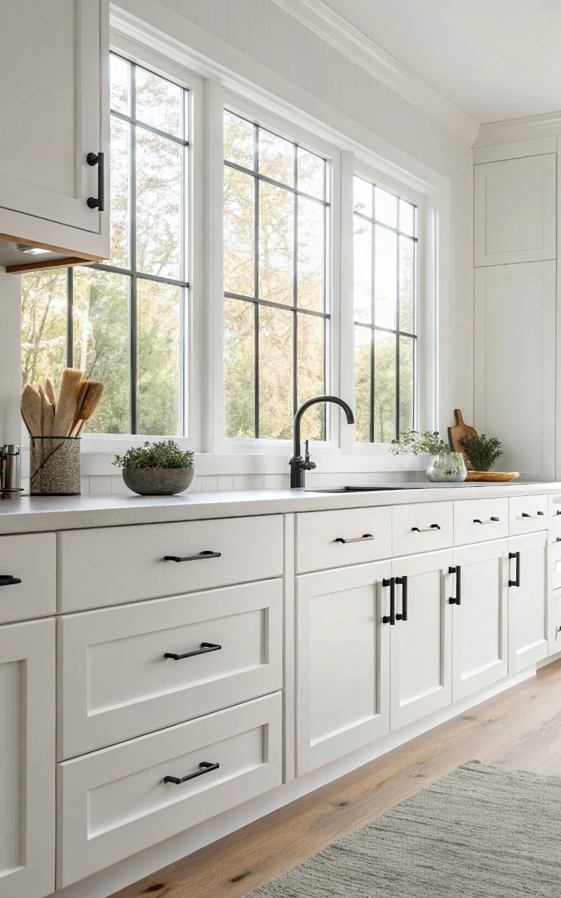
Switching to black handles on white cabinets added a clean, graphic detail that feels intentional. The small accents create definition without overwhelming the space. It’s minimal but visually sharp. The contrast adds depth in a subtle way. It’s an easy upgrade. Pro Tip: Choose slim, simple hardware for a cleaner look.
3. Black Countertops with White Cabinets
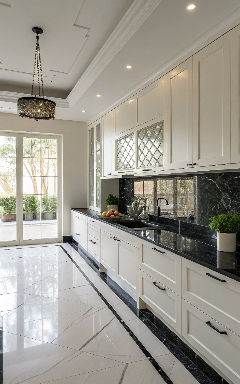
I added black countertops, and they grounded the entire kitchen while keeping the rest of the space light. The darker surface creates balance and anchors the design. It’s practical and stylish. The contrast feels natural. It’s simple, but impactful. Pro Tip: Use materials with minimal pattern for a sleek finish.
4. White Subway Tile with Dark Grout
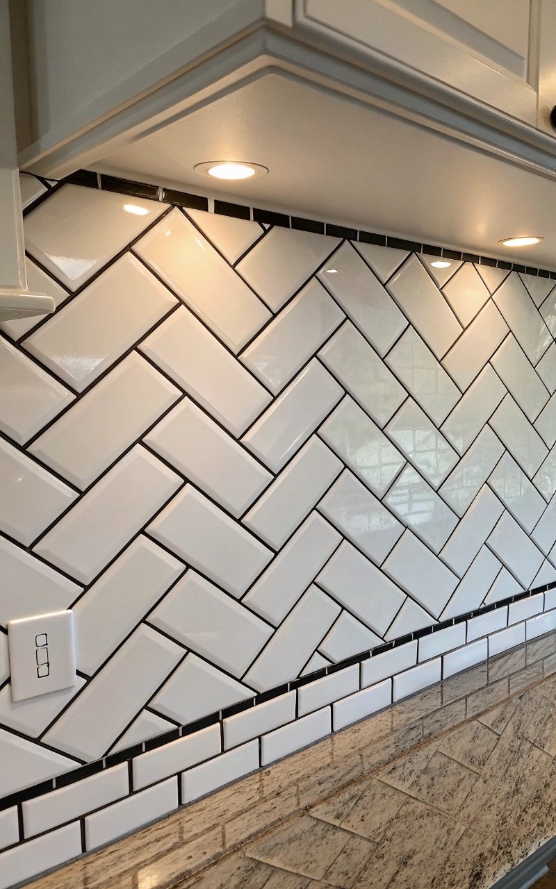
Using white subway tiles with dark grout created a clean pattern that adds subtle texture. The lines define the space without clutter. It’s classic with a modern twist. The contrast highlights the layout. It’s simple, but visually interesting. Pro Tip: Keep grout lines thin for a refined look.
5. Open Shelving with Black Brackets
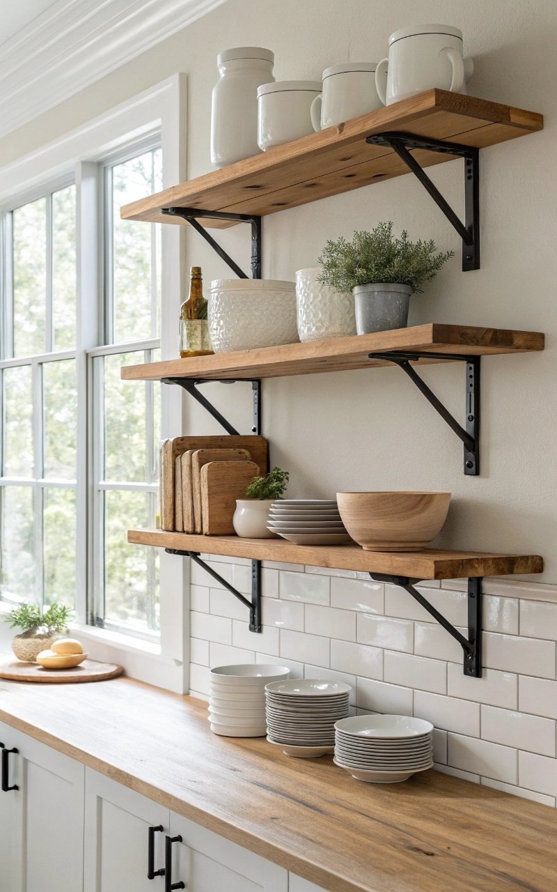
I installed open shelves with black brackets, and it added a light, functional display without making the space feel crowded. The black accents tie into the overall palette. The shelves keep everything accessible. It feels balanced and airy. It’s minimal and practical. Pro Tip: Keep shelf styling simple to avoid clutter.
6. Black and White Checkered Flooring
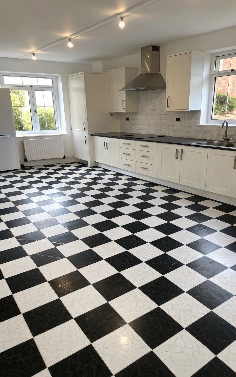
I tried a checkered floor, and it added personality while still staying within the monochrome theme. The pattern brings movement into the space. It feels bold but timeless. The design stands out without overwhelming. It’s a fun yet classic choice. Pro Tip: Use larger tiles for a more modern look.
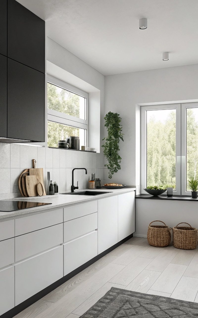
7. All-White Kitchen with Black Accents
Keeping the kitchen mostly white and adding small black details created a soft, minimalist look that feels clean and open. The accents provide just enough contrast. It keeps the space from feeling flat. The balance feels calm and intentional. It’s simple but effective. Pro Tip: Add texture through materials for depth.
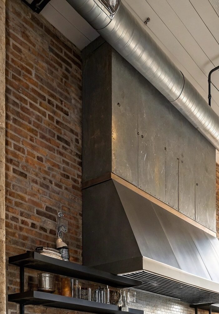
8. Black Range Hood Statement
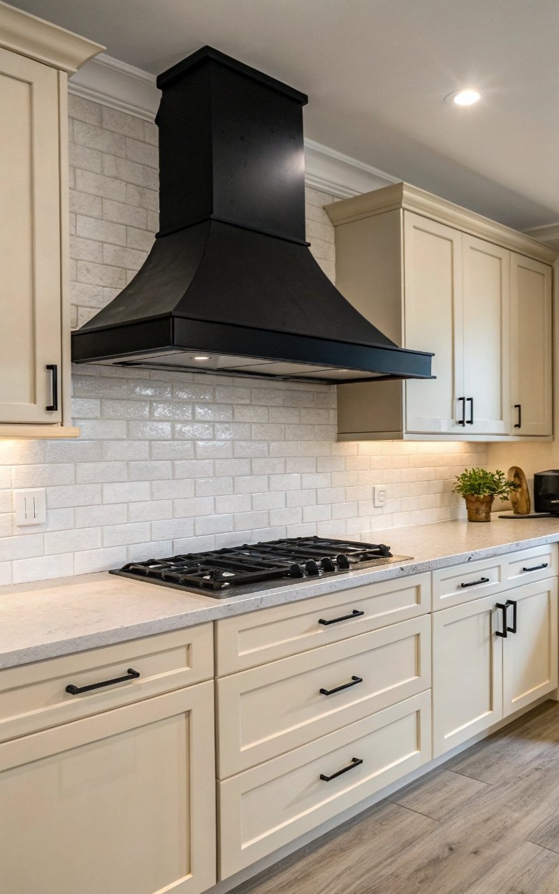
A black range hood became a focal point that adds structure to the kitchen. The bold shape draws the eye without needing extra decor. It anchors the design visually. The contrast feels strong but balanced. It’s minimal with impact. Pro Tip: Keep surrounding elements simple.
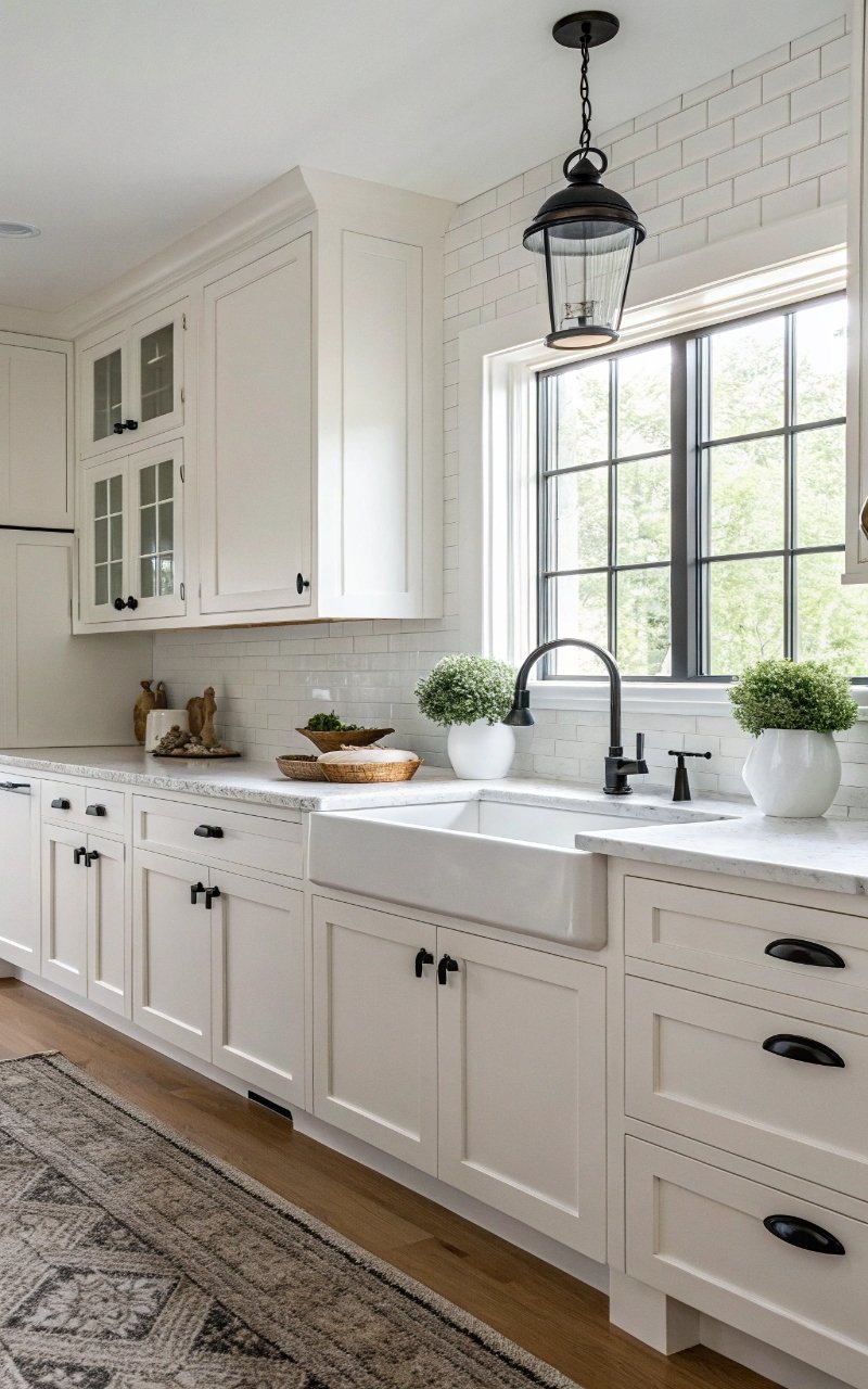
9. Minimalist Black Fixtures
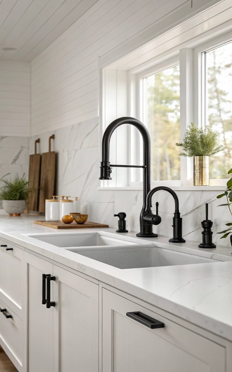
Switching to black faucets and fixtures added subtle detail that ties everything together. The small touches make a big difference. It keeps the design cohesive. The look feels modern and clean. It’s simple, but powerful. Pro Tip: Match finishes for consistency.
10. White Marble with Black Veining
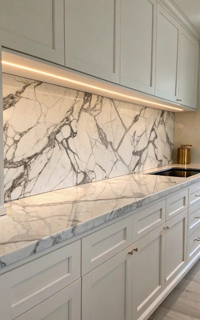
Using marble with black veining added natural texture while staying within the color palette. The patterns bring depth without clutter. It feels elegant but not overwhelming. The surface becomes a subtle feature. It’s refined and timeless. Pro Tip: Keep surrounding decor minimal.
11. Black Lower Cabinets, White Upper Cabinets
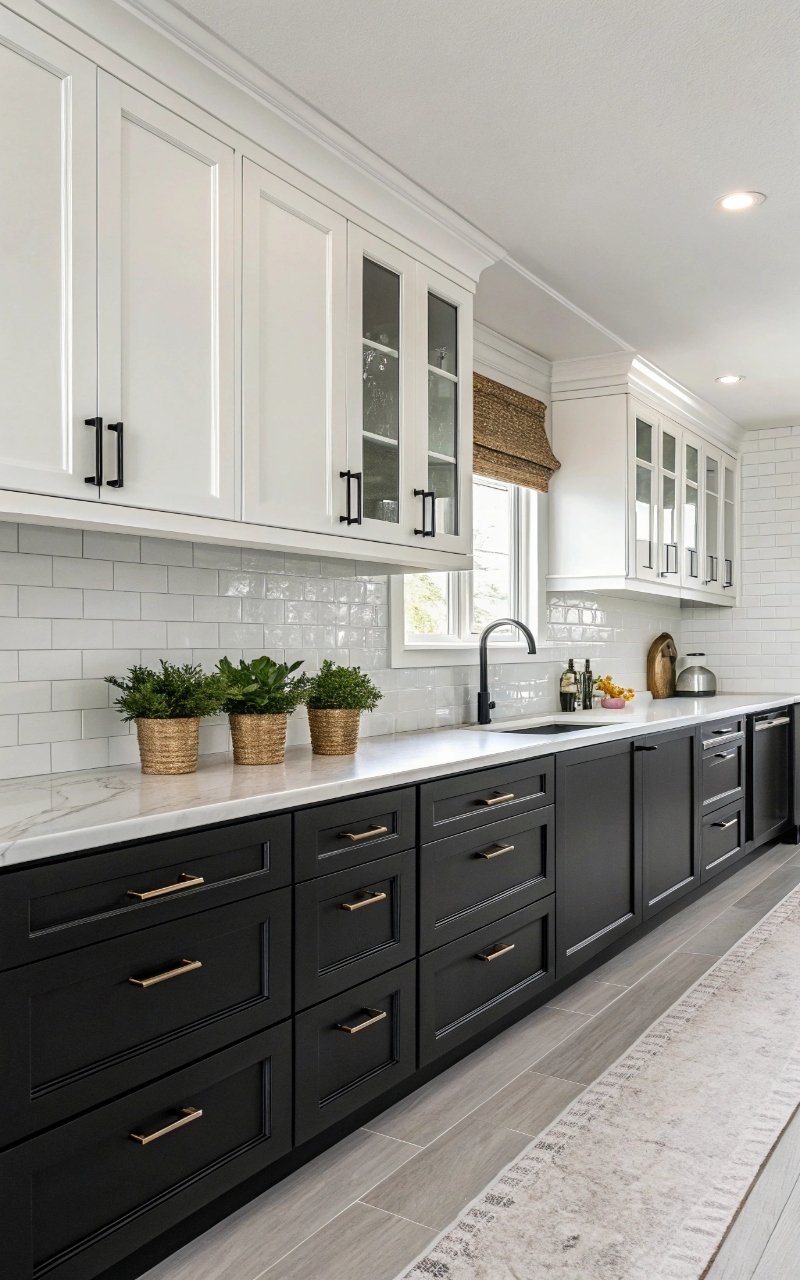
I split the cabinetry colors, and it created a balanced look that feels grounded but still light. The darker base anchors the space. The white upper cabinets keep it open. It’s a smart visual trick. It feels structured and airy. Pro Tip: Keep lines clean for a seamless look.
12. Glossy White Cabinets with Matte Black Accents
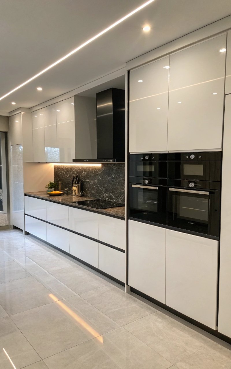
Combining glossy and matte finishes added depth and contrast beyond just color. The textures play off each other beautifully. It keeps the design from feeling flat. The mix feels modern and polished. It’s subtle but effective. Pro Tip: Avoid mixing too many finishes.
13. Black Framed Glass Cabinets
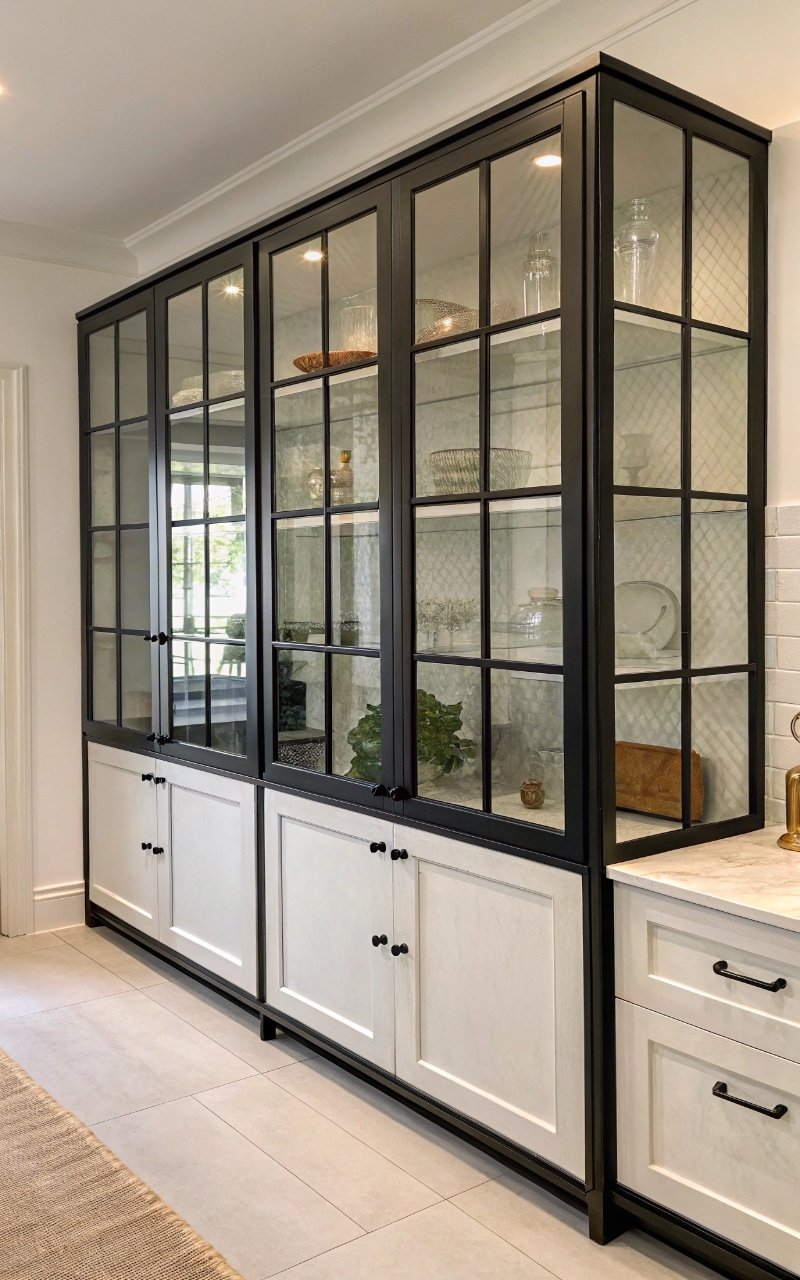
I added glass cabinets with black frames, and they created a light, structured look that feels modern. The transparency keeps things open. The frames add definition. It’s functional and stylish. It’s a clean, balanced design. Pro Tip: Keep contents organized for a neat look.
14. Minimal Decor with Clean Lines
Keeping decor to a minimum made the kitchen feel calm and uncluttered. Every item has a purpose. The simplicity enhances the overall design. The space feels more open. It’s less, but better. Pro Tip: Stick to functional decor pieces.
Conclusion
Black and white kitchens offer a sense of clarity and balance that makes everyday use feel more effortless and enjoyable. These ideas show how thoughtful contrast, clean lines, and minimal details can create a space that feels modern without being overwhelming. It’s about using simplicity to your advantage, letting each element stand out in a quiet, intentional way. That’s where the real appeal comes from.
What makes this style so effective is how timeless and adaptable it is, allowing you to adjust details over time without losing the overall look. You can soften it with textures or sharpen it with bold accents, depending on your preference. The foundation remains strong and versatile.
As you bring these ideas into your kitchen, focus on creating a space that feels both functional and calm. Small changes can make a noticeable difference when they’re done thoughtfully. In the end, it’s the balance between simplicity and detail that makes a minimalist black and white kitchen truly work.