16 Dark Apartment Design Ideas That Look Crazy Expensive
I still remember the first time someone walked into my apartment and asked where I got my “designer interiors,” and I almost laughed. Nothing was custom, nothing was high-end, but everything felt expensive because the space was dark, layered, and intentional. That moment taught me that luxury isn’t about price tags—it’s about mood. Dark design has a way of whispering confidence instead of shouting trends.
What I love about dark apartments is how they instantly feel curated and grown. Deep colors absorb light, slow the eye down, and make even simple furniture feel deliberate. When done right, dark interiors feel like boutique hotels or editorial spreads, even when the budget says otherwise.
If you want your home to feel rich, elevated, and secretly affordable, these dark apartment design ideas that look crazy expensive will help you create a space that feels bold, refined, and effortlessly luxe.
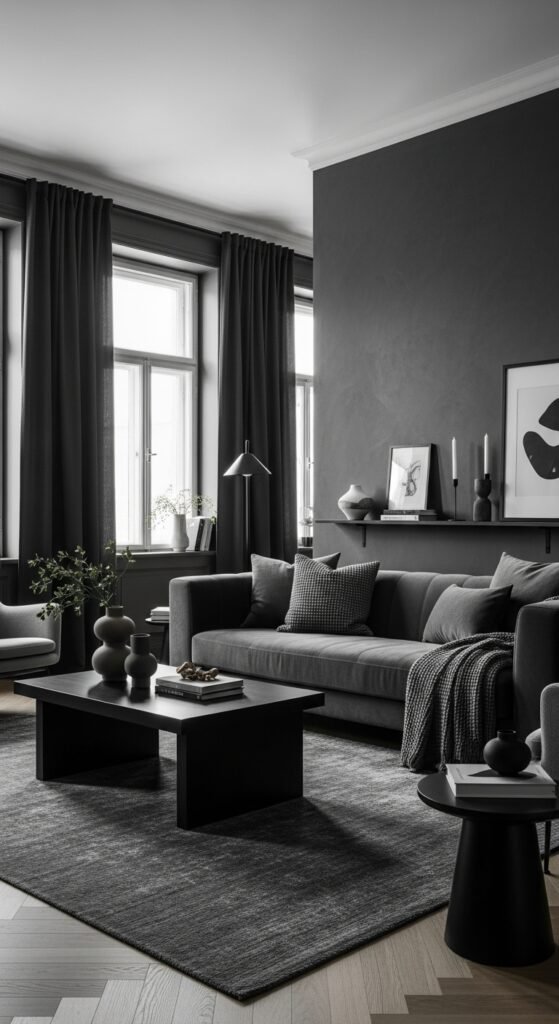
1. Matte Black Walls with Soft Lighting
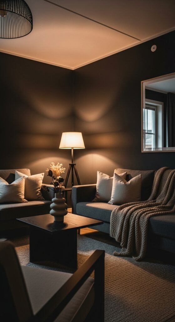
Matte black walls create instant drama and depth, especially when paired with warm, diffused lighting. I love how the finish absorbs light instead of reflecting it, making the room feel intimate and luxurious. Furniture stands out more, art looks intentional, and the space feels grounded. It’s bold without being flashy. Doesn’t matte black feel like quiet confidence? This is high-end energy done right.
Pro Tip: Balance with warm lamps and lighter textiles to soften the look.
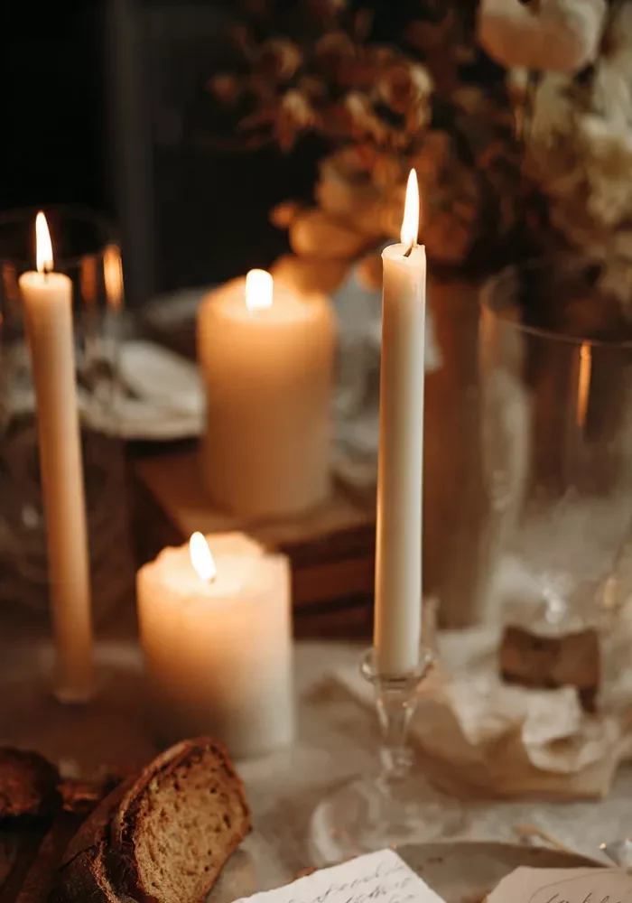
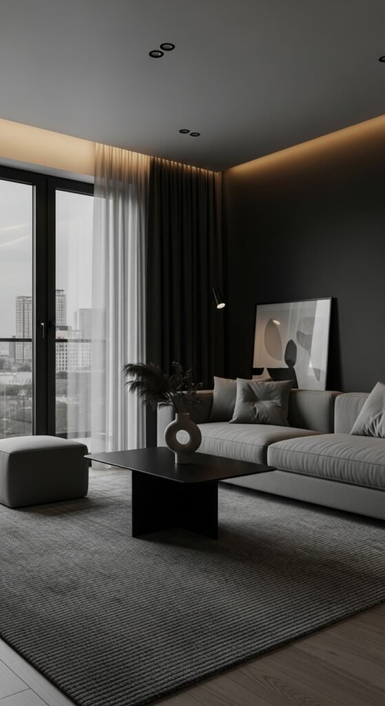
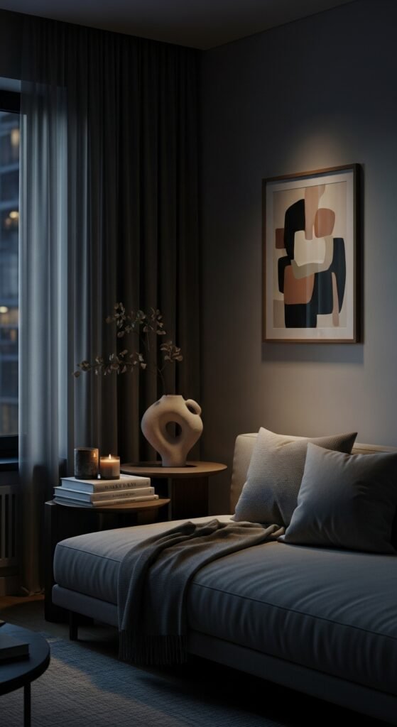
2. Floor-to-Ceiling Curtains in Dark Neutrals
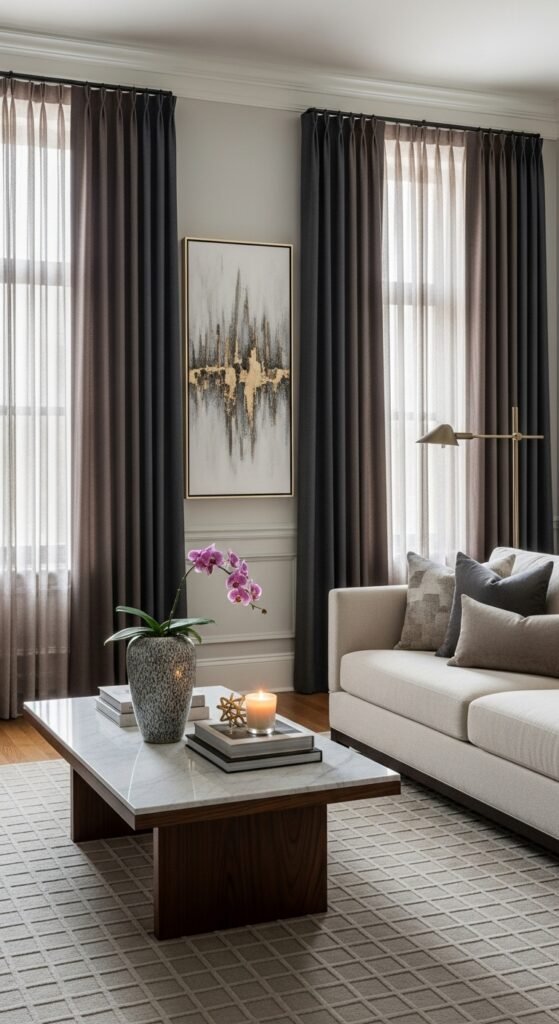
Long, dark curtains instantly make ceilings feel taller and rooms feel more expensive. I love how charcoal, espresso, or deep taupe fabric frames windows like a luxury hotel suite. The softness adds elegance, while the darkness adds drama. Light filters in gently instead of harshly. Doesn’t height always feel expensive? This trick never fails.
Pro Tip: Hang curtains just below the ceiling line for maximum impact.
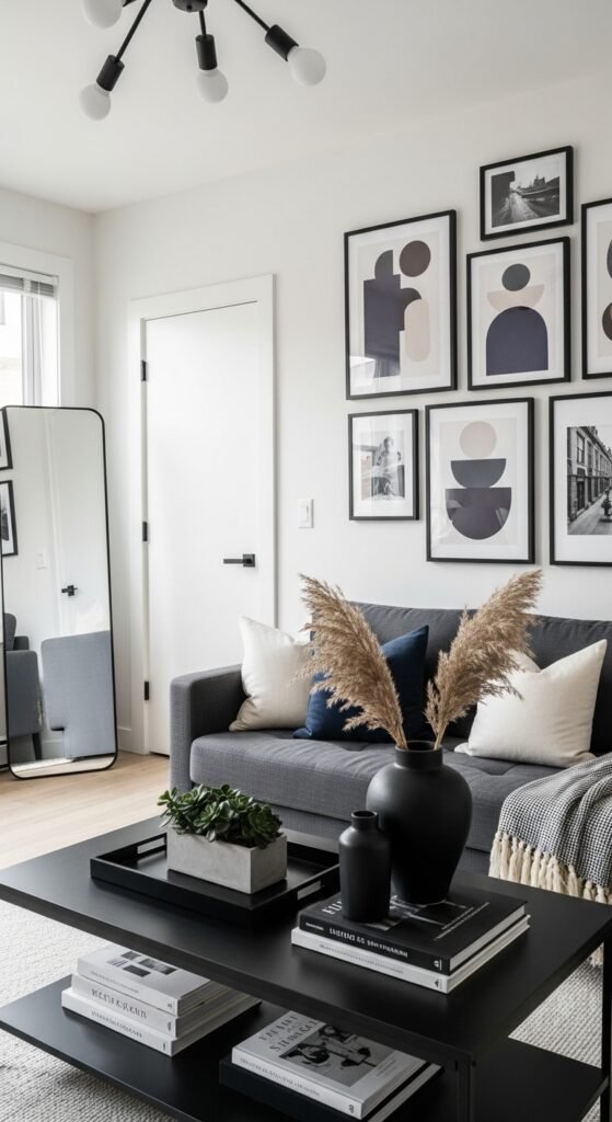
3. Dark Walls Paired with Light Artwork
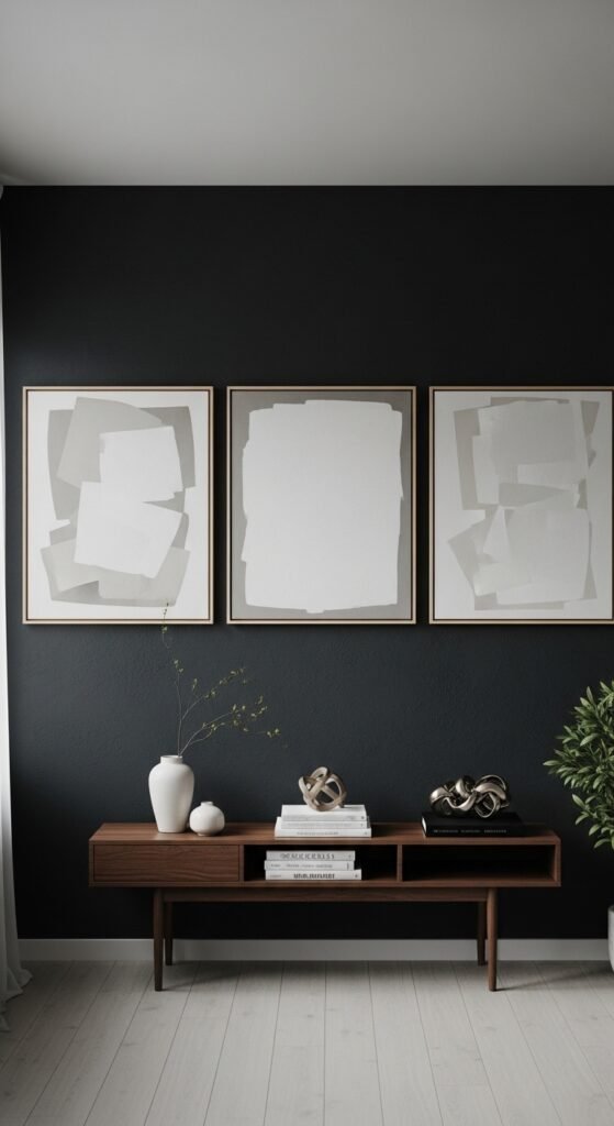
Light or neutral art against dark walls creates striking contrast that feels gallery-worthy. I love how artwork suddenly looks intentional and curated instead of decorative. The walls become a backdrop instead of the focus. Everything feels editorial. Doesn’t contrast make art feel more important? This is how designers do it.
Pro Tip: Choose oversized pieces to avoid visual clutter.
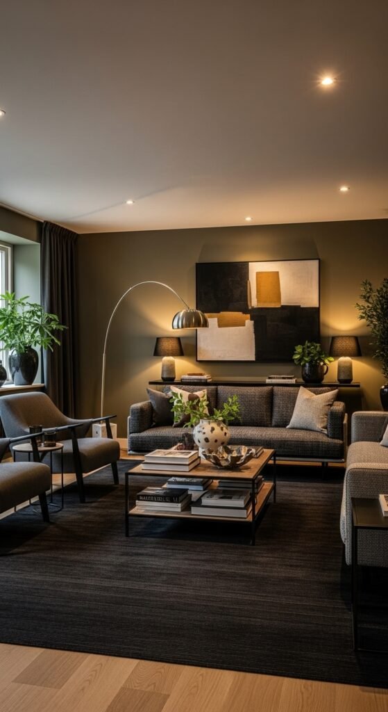
4. Deep, Monochrome Color Palettes
Using different shades of the same dark color creates a layered, expensive look. I love charcoal-on-charcoal or deep green paired with darker olive tones. The space feels cohesive and thoughtful. Nothing fights for attention. Doesn’t restraint always feel luxurious? Monochrome is subtle power.
Pro Tip: Vary textures so the palette doesn’t feel flat.
5. Dark Wood Furniture with Clean Lines
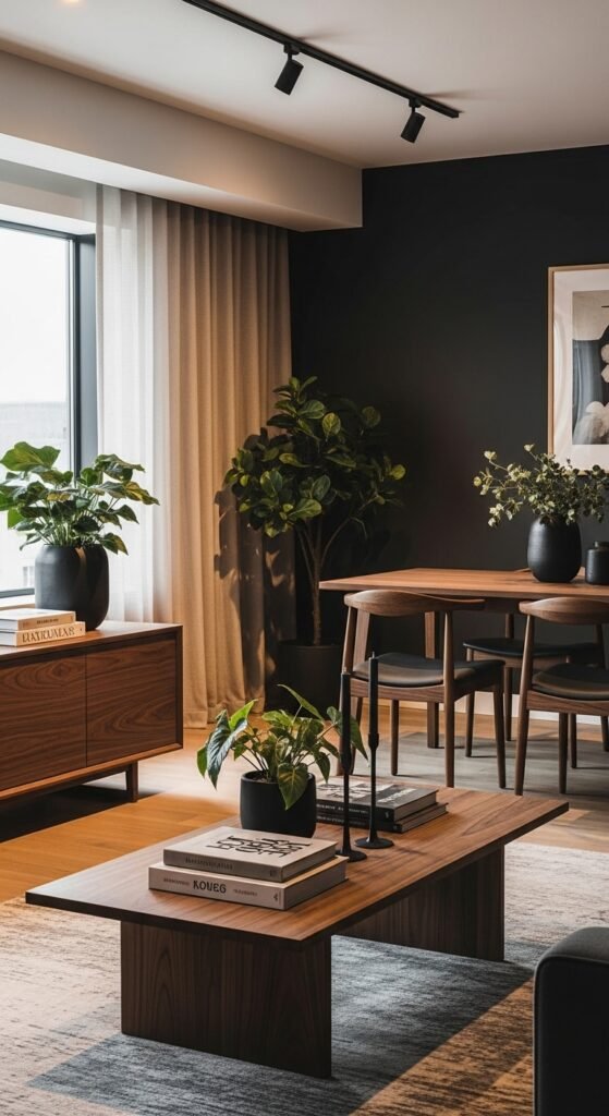
Dark wood instantly signals quality and warmth when paired with simple silhouettes. I love how walnut or espresso tones ground a space without making it feel heavy. The furniture feels timeless and intentional. It adds richness without excess. Doesn’t wood always elevate a room? Especially when it’s dark.
Pro Tip: Avoid overly ornate shapes to keep it modern.
6. Layered Textures in Similar Dark Tones
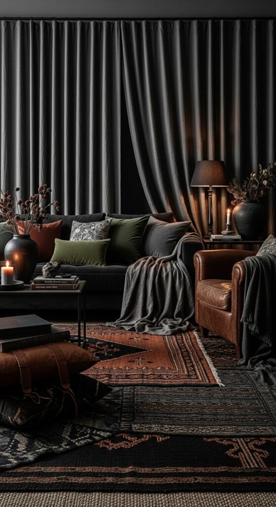
Texture is what makes dark spaces feel rich instead of dull. I love layering velvet cushions, linen curtains, leather accents, and woven rugs in similar hues. The room becomes tactile and cozy. Every surface invites touch. Doesn’t texture make darkness feel alive? It’s the secret to expensive-looking interiors.
Pro Tip: Stick to one color family for cohesion.
7. Statement Dark Accent Walls
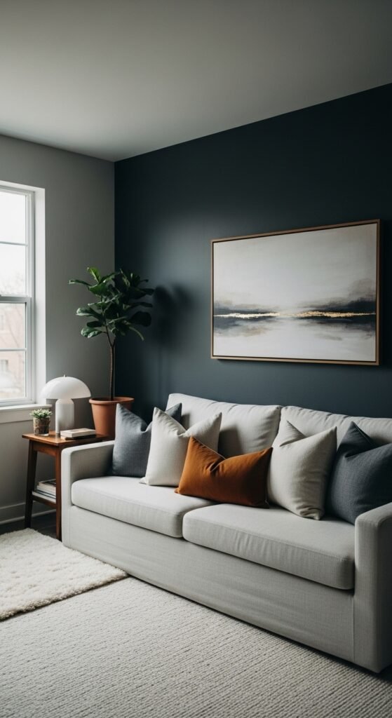
A single deep-toned wall can make an apartment feel designed rather than decorated. I love placing it behind a sofa or bed to anchor the room. It adds drama without overwhelming the space. The layout feels intentional. Doesn’t one bold choice change everything? This one always does.
Pro Tip: Keep surrounding walls lighter for balance.
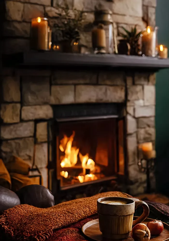
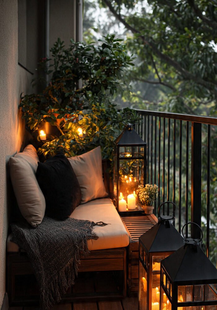
8. Sculptural Lighting in Dark Finishes
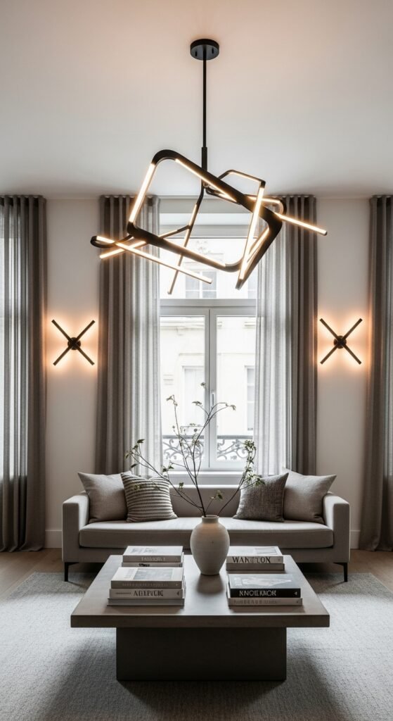
Lighting that doubles as art instantly raises the design level. I love black, bronze, or smoked-glass fixtures that feel architectural. Even when off, they add presence. The room feels curated, not cluttered. Doesn’t sculptural lighting scream designer? It’s a subtle flex.
Pro Tip: Choose warm bulbs to maintain a cozy glow.
9. Dark Rugs That Anchor the Space
A dark rug grounds furniture and makes a room feel settled and intentional. I love how it hides wear while adding depth. The space feels complete instead of floating. Everything feels anchored. Doesn’t grounding create calm? It’s an expensive-looking detail that works hard.
Pro Tip: Choose low-pile rugs for a sleek finish.
10. Black or Charcoal Kitchens with Minimal Hardware
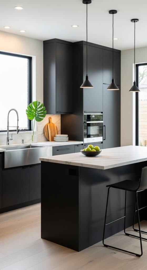
Dark kitchens feel bold, confident, and undeniably high-end when kept simple. I love matte black or charcoal cabinetry paired with understated hardware. The lines stay clean, the mood stays elevated. It feels modern without being cold. Doesn’t dark cabinetry feel powerful? It’s luxury without excess.
Pro Tip: Balance with light countertops or backsplash.
11. Moody Bedrooms with Layered Bedding
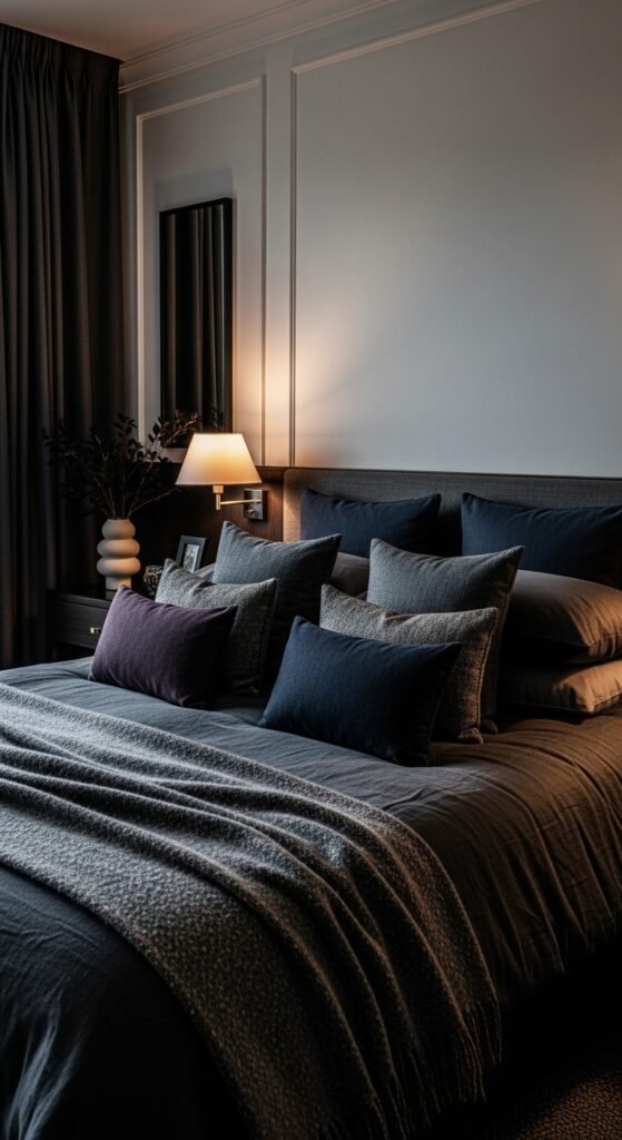
Dark bedrooms feel like a cocoon, and that comfort reads as luxury. I love deep bedding layered with subtle contrast in pillows and throws. The bed becomes the focal point. The room feels restful and indulgent. Doesn’t darkness make sleep feel better? It’s hotel energy at home.
Pro Tip: Use soft, breathable fabrics to keep it inviting.
12. Repeated Black Accents Throughout the Apartment
Repeating black details—frames, trays, hardware—creates visual flow that feels intentional. I love how it quietly ties rooms together. Nothing feels random. The apartment feels cohesive and styled. Doesn’t repetition feel polished? Designers rely on this trick.
Pro Tip: Stick to matte finishes for softness.
13. Dark Built-Ins or Shelving
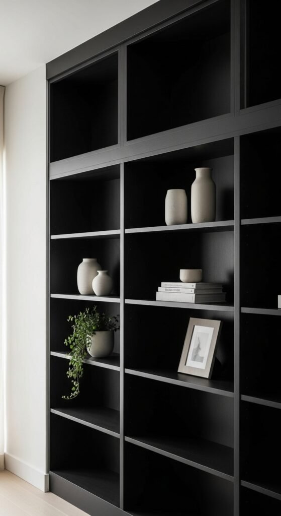
Dark shelves instantly elevate storage and make decor pop. I love how objects stand out against a deep background. The shelves feel curated instead of cluttered. Storage becomes design. Doesn’t contrast make styling easier? This is a designer move.
Pro Tip: Leave negative space so pieces can breathe.
14. Minimal Decor with Bold Negative Space
Luxury interiors know when to stop. I love dark spaces with fewer decor pieces and more breathing room. Every item feels important. The room feels calm and confident. Doesn’t space itself feel expensive? Less really is more here.
Pro Tip: Remove one item from every surface and reassess.
15. Metallic Accents Used Sparingly
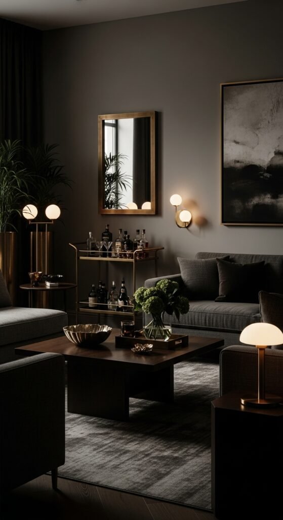
Brass, bronze, or antique gold shine beautifully against dark palettes. I love how they catch light without overpowering the room. The effect feels warm and intentional. It adds quiet glamour. Doesn’t subtle shine feel richer than sparkle? This balance is key.
Pro Tip: Choose one metal tone and repeat it.
16. Intentional Editing for a Clean Finish
Dark apartments look most expensive when clutter disappears. I love editing relentlessly so every piece has purpose. The space feels calm, not crowded. Darkness shines best when it’s uninterrupted. Doesn’t clarity elevate everything? This is the final polish.
Pro Tip: Store everyday items out of sight.
Conclusion
Dark apartment design looks expensive because it slows everything down. It creates mood, depth, and intention without relying on trends or excess. When paired with thoughtful lighting and restraint, dark interiors feel timeless and elevated.
What makes these spaces feel truly luxurious is how confident they are. Nothing is trying too hard. Every choice feels deliberate, calm, and grounded. That confidence is what reads as “expensive.”
So if you want your apartment to feel like a high-end editorial spread without the high-end price tag, embrace the dark side. With balance, texture, and intention, your space can look crazy expensive—and feel even better to live in.